Have Questions? Let’s Talk!
Is your website working against you – without you even realizing it?
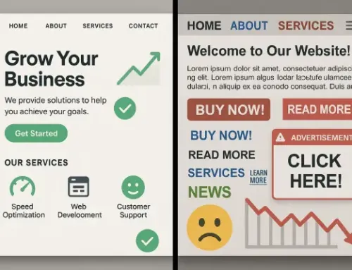
You’ve put time and money into your site. It looks professional, your content is on point, and you’re driving traffic. But here’s the catch: visitors aren’t converting. They’re leaving before taking action, and the culprit might be hiding in plain sight – your navigation structure.
Your site’s navigation isn’t just a menu bar. It’s the roadmap that guides users where they want to go. If that path is confusing, cluttered, or buried in too many clicks, visitors won’t stick around. And when users can’t find what they’re looking for, they don’t complain, they just leave.
In this post, we’ll break down the most common navigation mistakes, show you how they’re impacting your conversion rates, and give you actionable tips to fix them. Because when your navigation works, your website works harder, for you and your customers.
What Website Navigation Really Is (and Why It’s Often Overlooked)
When people think about website navigation, they usually picture the menu at the top of the page. But true navigation is much more than just a header with links, it’s the entire framework guiding users through your content, helping them understand where they are, where they can go, and how to get what they came for.
Effective navigation includes:
Despite its importance, navigation is one of the most commonly neglected areas in web design. It often falls victim to design trends, bloated content strategies, or “set it and forget it” thinking during a website build. But what seems like a small issue – a buried service page or confusing dropdown menu – can create real friction for users, costing you engagement, trust, and ultimately, conversions.
Red Flags: Signs Your Navigation Is Hurting Conversions
Your website might look great, but if users can’t find what they need, they won’t stick around. Poor navigation isn’t always obvious at a glance, but your analytics can tell a different story.
Here are some key warning signs that your navigation structure is costing you leads and sales:
High Bounce Rates on Key Pages
If visitors are landing on your site and leaving almost immediately, it’s a strong indicator they’re not finding what they expected, or what they need, fast enough. Confusing menus or missing content pathways often drive users away before they even engage.
Form and Cart Abandonment
Are users starting to fill out forms or add items to their cart, only to disappear before completing the process? A poorly structured site can create too many steps, unclear paths, or unnecessary friction, pushing potential customers out of your funnel.
Overuse of Site Search
If your visitors are skipping your menus and heading straight for the search bar, it’s often because your navigation isn’t intuitive. While search functionality is important, it shouldn’t be your users’ primary way of getting around.
Rage Clicks and Erratic Scrolling on Heatmaps
Heatmap tools can reveal frustration. Rage clicks, repeated clicks on unresponsive elements, or random scroll patterns often mean users are confused about where to go next. This behavior is a signal that your menu labels, structure, or calls-to-action might need attention.
Mobile Drop-Offs
If your mobile traffic is high but conversions are low, your navigation could be to blame. Clunky, collapsed menus, small touch targets, or hidden key pages can lead to quick exits from frustrated mobile users.
Spotting these red flags is the first step. The good news? Each one points to a clear opportunity to optimize your navigation and your conversions.
How Poor Navigation Breaks the Conversion Funnel
Your website’s navigation is more than just a menu, it’s the roadmap that guides visitors from curiosity to conversion. When it’s poorly structured, users get lost, frustrated, or simply leave.
Here’s where things often fall apart:
Small missteps in navigation quickly snowball into missed opportunities. Clean, intuitive paths help visitors feel confident and ready to act, while poor structure breaks that momentum and drives them away.
Best Practices for Conversion-Driven Navigation
Your website’s navigation isn’t just a map — it’s a strategic tool that should guide visitors to take action. Whether that’s making a purchase, filling out a form, or booking a service, a well-structured navigation can reduce friction and drive more conversions.
Here’s how to get it right:
1. Keep it Simple and Predictable
Avoid clever labels and stick with terminology your visitors expect. Use clear categories like “Menu,” “Services,” “Pricing,” or “Contact” instead of brand-specific jargon. Familiarity reduces decision fatigue and helps users move faster toward their goal.
2. Limit Menu Options
Too many choices can overwhelm visitors and lead to decision paralysis. Stick to 5–7 top-level navigation items and organize submenus logically. Prioritize the pages that directly support your sales funnel.
3. Prioritize Mobile Navigation
With the majority of users browsing from mobile devices, your navigation must be responsive and thumb-friendly. Use sticky headers, hamburger menus, and collapsible sections to make navigation seamless on smaller screens.
4. Use Visual Hierarchy
Design your navigation to visually guide users. Highlight CTAs like “Book Now” or “Get a Quote” with contrasting colors or button styling. Make your most valuable pages more prominent through placement and font weight.
5. Include Search — But Don’t Rely on It
A search bar can be helpful, but it shouldn’t replace intuitive navigation. Users turn to search when they’re lost, so consider it a backup rather than a primary pathway.
6. Test and Iterate
Use tools like heatmaps, session recordings, and A/B testing to see where users are dropping off or hesitating. Your navigation should evolve based on real user behavior and performance metrics.
Clean Navigation, Better Conversions
Your website’s navigation isn’t just a design feature, it’s a direct line to your bottom line. When users can’t find what they need quickly and intuitively, they leave. And every exit is a missed opportunity. By simplifying your structure, identifying red flags, and continuously testing, you turn confusion into clarity and clicks into conversions.
A streamlined, user-friendly navigation system creates a smoother journey from first click to final purchase. And when your visitors aren’t wasting time hunting for information, they’re far more likely to take action.
Need help uncovering what’s holding your website back? Our team specializes in building conversion-optimized, user-first digital experiences.
Let’s Elevate Your Business Together
We’re here to help you navigate the latest trends, adopt innovative solutions, and tackle your biggest challenges. Whether you’re exploring POS systems, managed IT services, or website design, our experts are ready to provide tailored guidance for your business.
Fill out the form below to schedule your free consultation. Let’s create a solution that works for you.


